Sense and Sensibility
by Jane Austen
Book design by Rebecca Fofonoff
About the Book
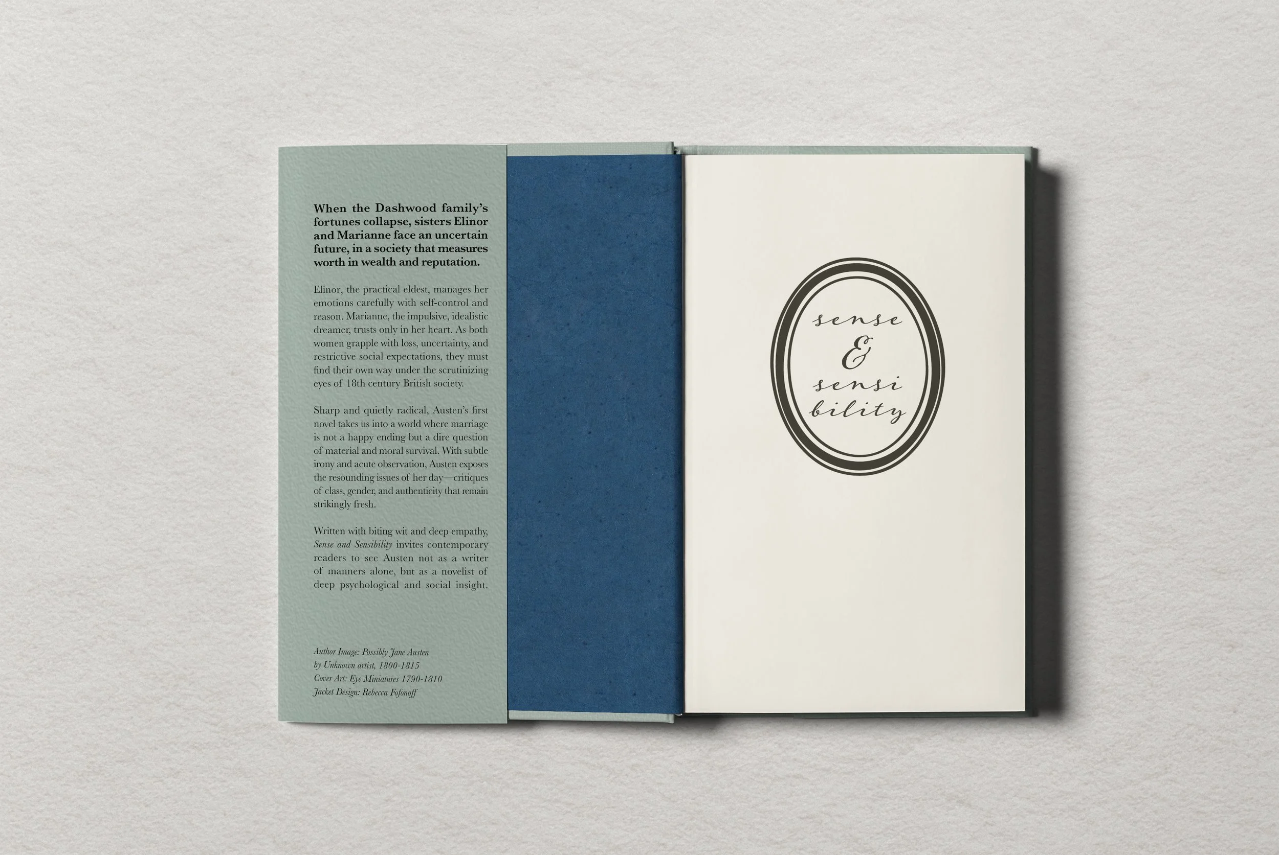
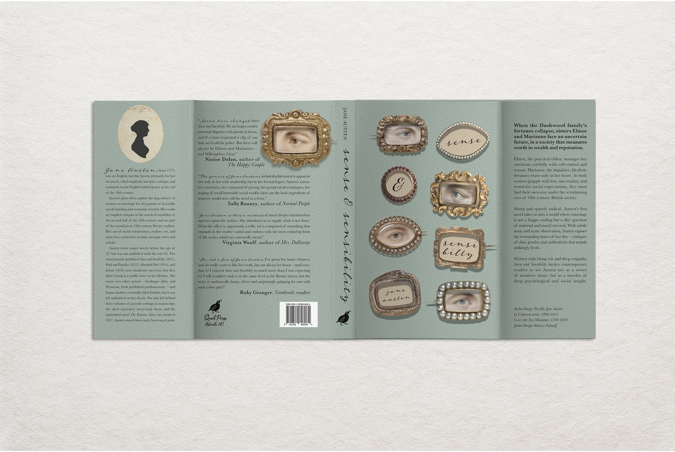
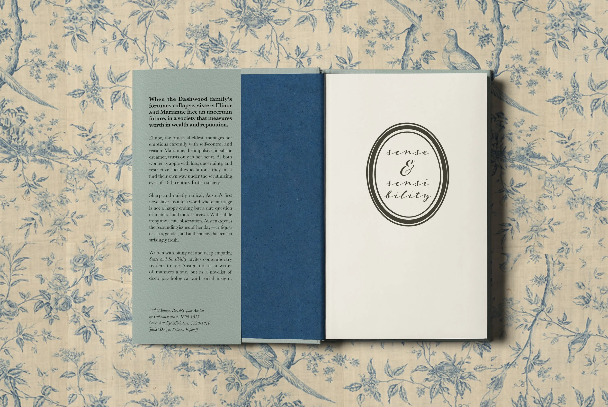
Jane Austen’s first novel follows two sisters in 18th century British society as they navigate financial instability, familial drama, societal pressures, and courtship misadventures. At the heart of the book is the complex relationship between the sisters and the vivid critique of social norms during the period.
Audience
While Austen’s work has been in print for centuries, recent editions have been targeted at a relatively narrow readership: Austen aficionados prepared for academic, annotated editions, and historical romance fans hungry for the frills and courtship tales of the Regency era. I attempted to repackage the text to appeal to readers of contemporary fiction, along with historical nonfiction, encompassing readers who might not have considered Austen for them.
Notes on Cover Design
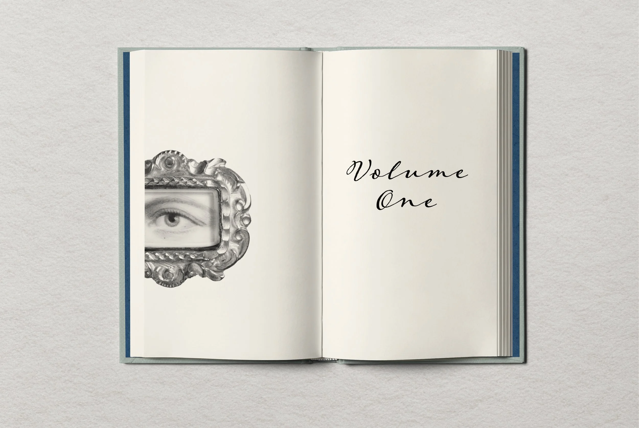
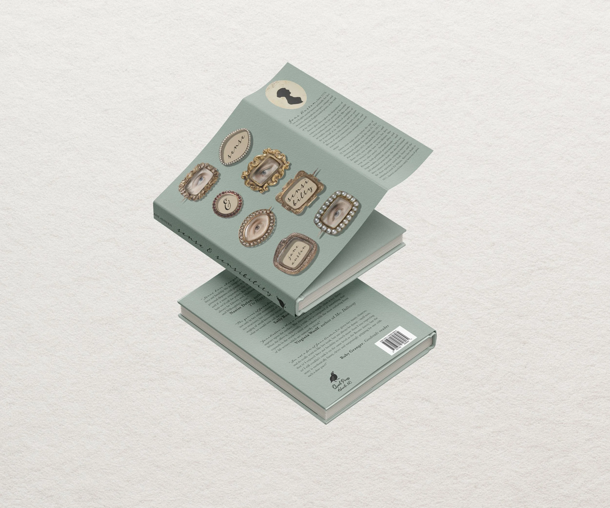
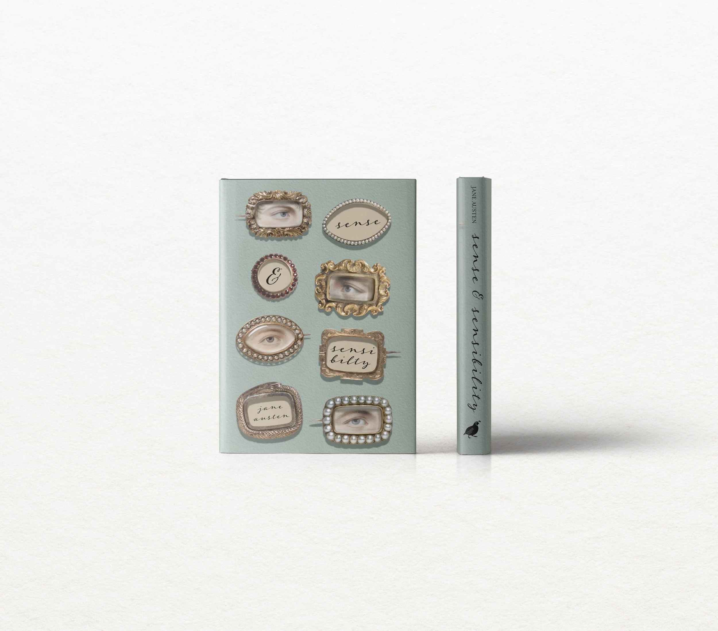
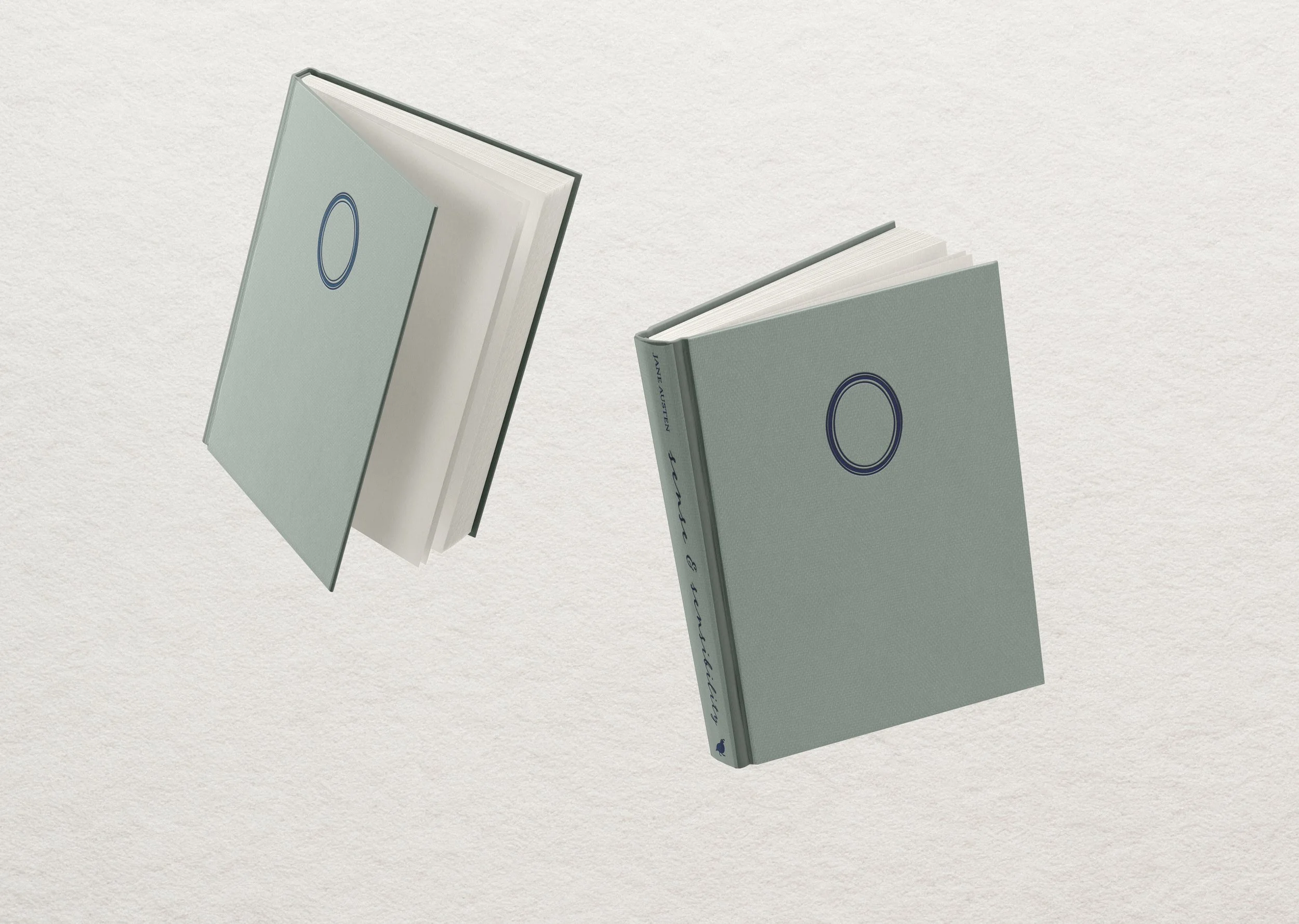
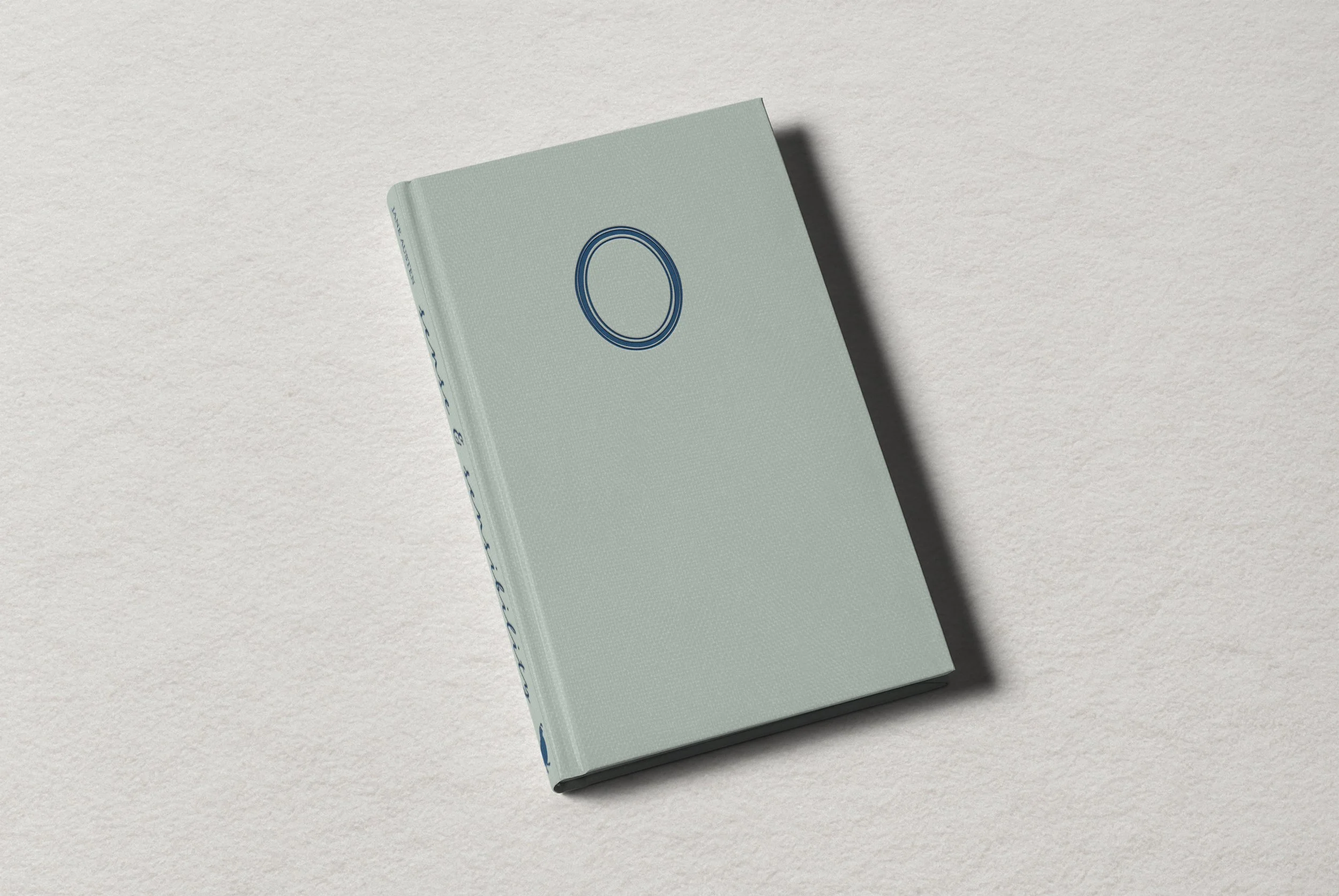
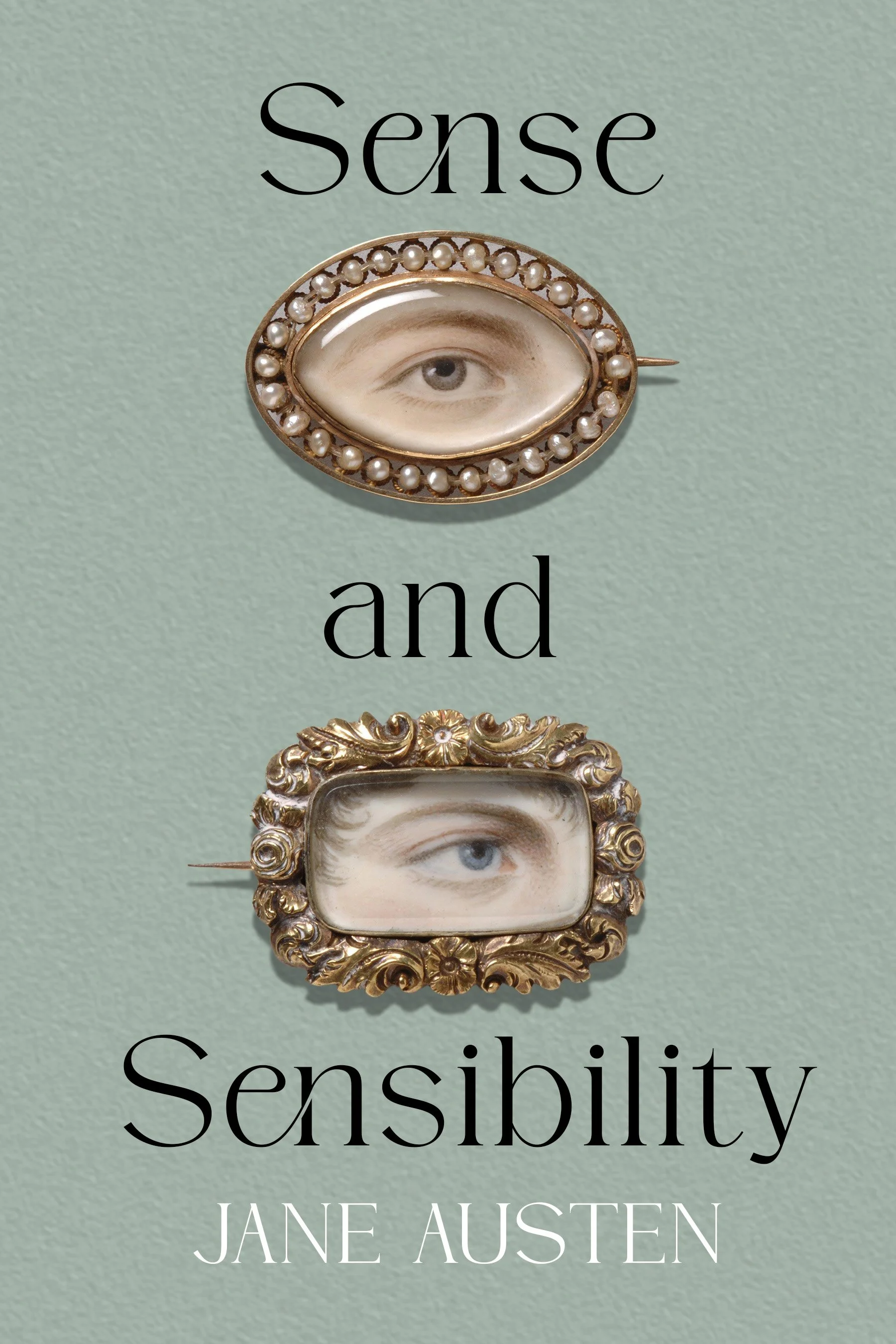
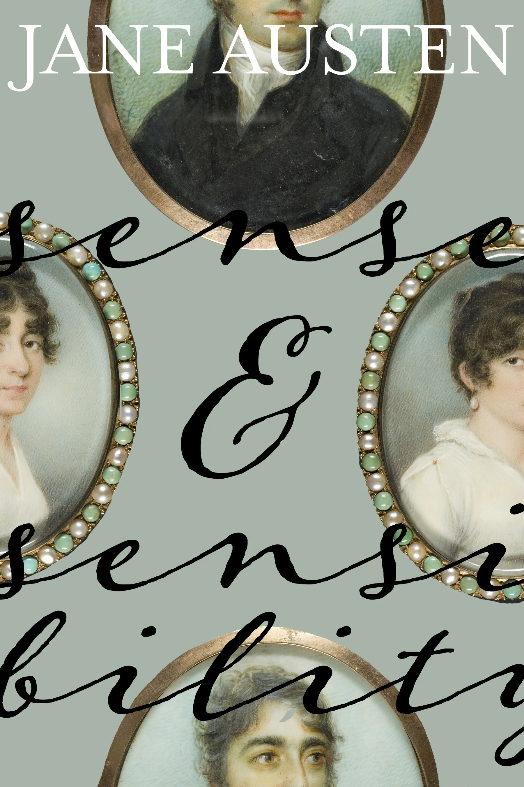
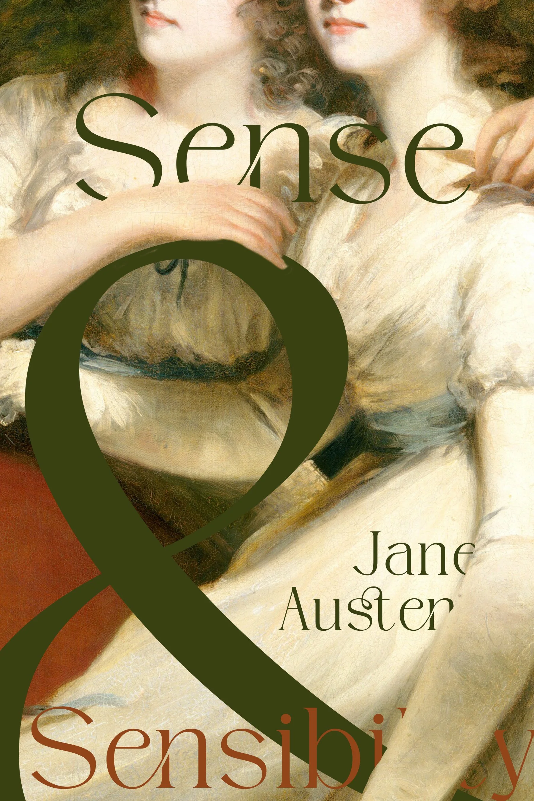
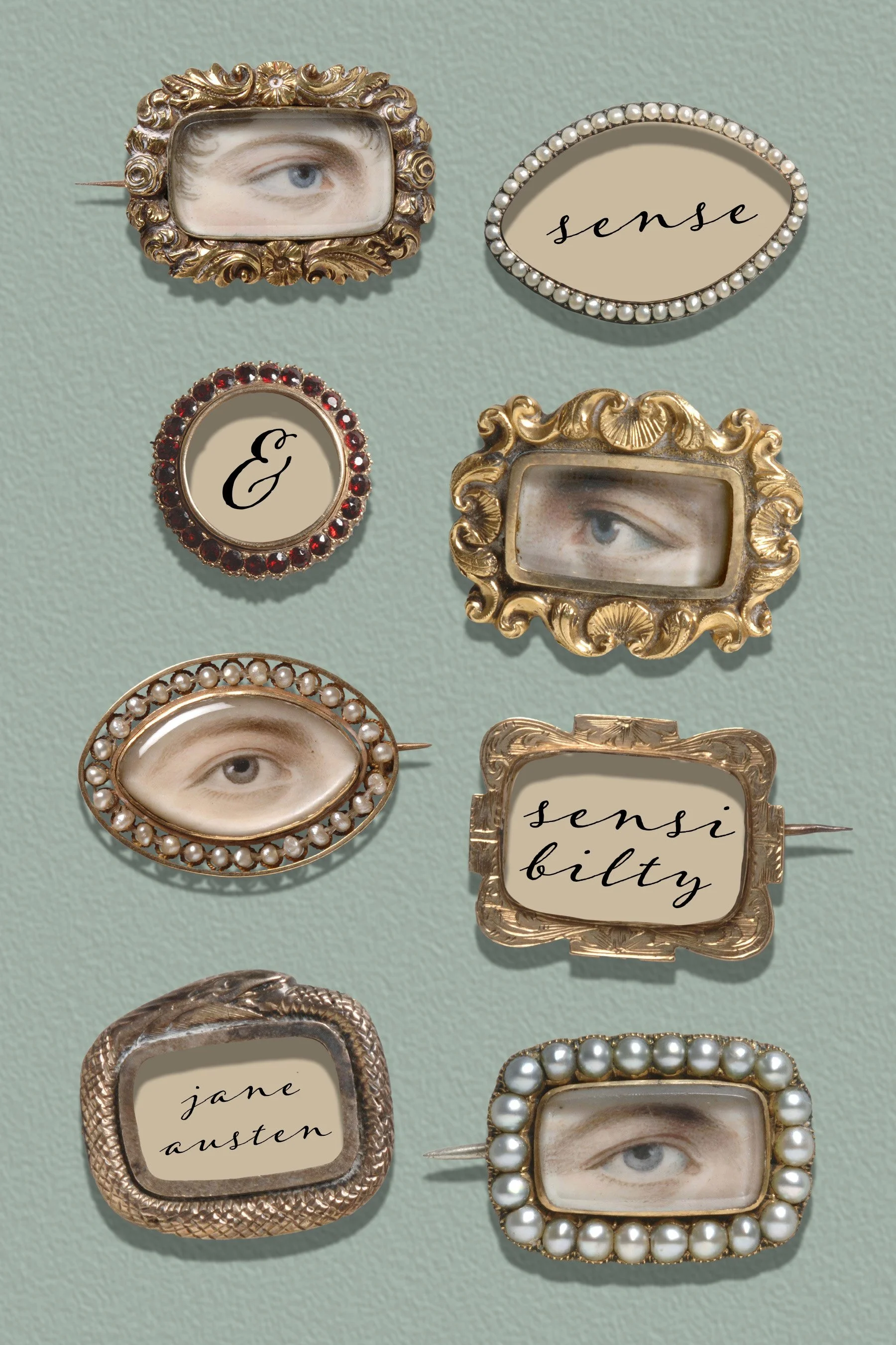
For the cover I tried to position the well-known novel as unfamiliar by placing period artwork in a contemporary context. The design I landed on features miniature eye portraits, later known as “lovers’ eyes” which became a popular token exchanged between courting couples in late 18th century society. Used on the cover, the eye portraits have the potential to beckon and intrigue readers, perhaps even make them uncomfortable, while hinting at the relentless gaze of society watching the novel’s heroines.
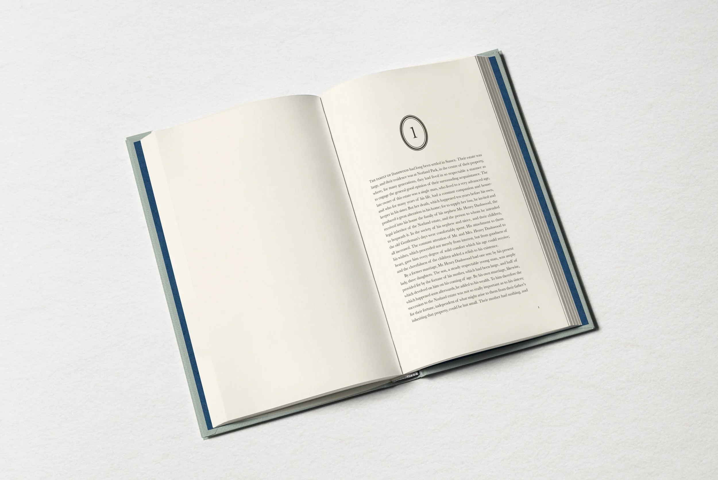
Type
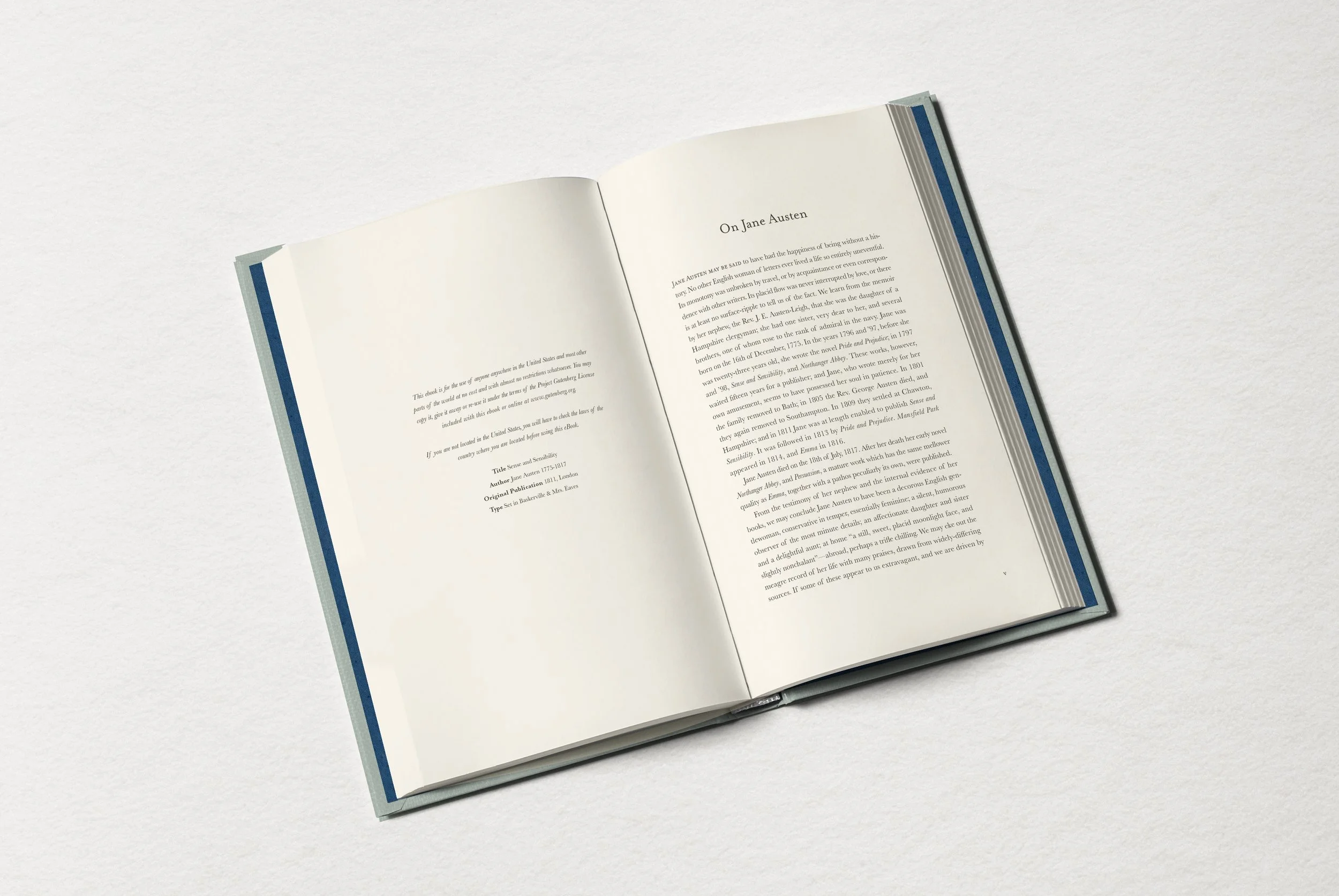
The body type is set in the classic British typeface Baskerville, designed by Englishman John Baskerville in the 18th century, while the chapter opener lead type is set in Mrs. Eaves. Designed by Zuzana Licko in 1996, Mrs. Eaves pays tribute to John Baskerville’s assistant and mistress-eventually-wife Sarah Eaves, who ran his studio after his death and received little recognition for her work. Given the focus on the financial fates of women in this novel, this pairing seemed a nice nod to Austen’s themes. The cover and volume openers feature Adorn, a script typeface by Laura Worthington, meant to evoke all the letter writing in the novel.
Original Publication Date
1811
Intended Audience
Readers of contemporary fiction, fans of history, social critique, sharp wit and complicated female protagonists
Trim Size
6 × 9 inches
Manufacturing Specifications
jacketed hardcover with foil stamped case